


 Looking for data
Before we move on: a word of caution. It is usual to determine averages for activities to allow them to be compared €“ the three values most often used are the mean, median and mode. For example, say your staff input (blood pressure monitor sales perhaps) over six days is: 1, 3, 3, 4, 5, and 6.
- The mean is calculated by adding a group of numbers and then dividing by the count of those numbers. For the above example, the total is 22 divided by 6, which averages 3.67.
- The median is the middle number of the group of numbers; that is, half the numbers have values that are greater than the median, and half the numbers have values that are less than the median €“ in this case 3.5.
- The mode is the most frequently occurring number in a group of numbers, and in this example the mode is 3.
For a symmetrical distribution of a group of numbers, these three figures are all the same. But for a skewed distribution such as in the above data set, the three figures are different.
When you are comparing figures, be clear about what is being quoted. It is possible for people to cite the figure that best favours their cause as the average. For example, a manager may say the average staff levels are nearly four, whereas a union representative might say the average is three.
Analysis and presentation
The MS Excel package provides many of the basic manipulations you will require and you can use it to develop methods of monitoring your basic outcomes. Other packages available will achieve similar results.
Don't underestimate the power of a graph to share performance data with staff for example €“ these are easily created. You can find most of the analysis tools under MS Excel Formulas/More Functions/statistical. Graphs are produced by highlighting the spreadsheet data you wish to present and choosing a style.
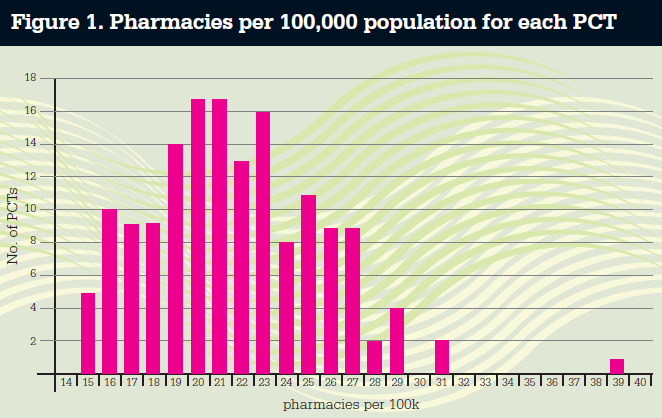
You can present your data in groups in bar charts or graphs to help show the spread and analyse it. For example, Figure 1 shows a barchart of the latest figures for the average number of pharmacies per 100,000 population per primary care trust in England. The bar chart shows that there is considerable variation, with a range from 15 to 39. The modal figure is 20.5, the median 21 and the average is 21.65.
To help show the degree of variation in the data, also calculate the standard deviation (using MS Excel Formulas/More Functions/Statistical). The data set is now more fully described as having a mean of 21.65, with a SD of 3.9. The lower the SD, the less variation in the data around the mean and the more constant is the activity. The example in Table 1 shows this to better effect.
Use trends to plan ahead
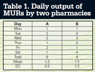 The mean number for each is 1.5 a day, but the SD of B is three times higher. Thus A is the more consistent and predictable and easy to manage while B is less consistent and predictable and is more difficult to manage. You can use SD to set control limits that will let you know action or investigations are required because, in a normal distribution, 66 per cent of the data lies within =/- 1SD; 95 per cent of a set of data lies within +/- 2SD and 99.5 per cent lies within +/- 3SD.
So if you set control limits of the mean +/- 2SD, then 95 per cent of your figures should lie within it and if over time the outliers are higher than 5 per cent they may be seen as being out of control.
In Figure 1, with a mean of 21.65 and the standard deviation of 3.9, the lower control limit is 21.65 - 7.8 = 13.85 and the upper one is 29.45. So there are three PCTs whose levels of 31-39 are outside the control limits. This raises questions as to why? For example, Westminster has a low resident population and a high daytime working population.
From Table 1 we know that for A, 95 per cent of days will be covered by a range of 0.5-2.5, so if the number falls to 0 for more than 5 per cent of days something has changed. Further investigation may reveal ways of reducing the variation for B.
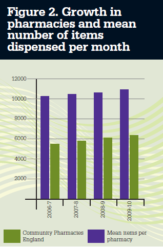 It is also possible to use MS Excel to monitor trends and to help you make predictions for your business with some accuracy. Figure 2 shows the growth in pharmacies and mean number of items dispensed per month over the period 2006 to 2010. Both values appear to be growing in a linear fashion with time. It is possible to use Excel to calculate how close these lie to a straight line and what is the best straight line fit and use that to try to predict future trends.
To do this you need to calculate the correlation coefficient (CC). A coefficient of 1.0 indicates that all points lie on the best straight line and a figure of 0.0 indicates the numbers are random and do not fit any trend. A positive correlation indicates a growing trend and a negative one a
falling one. For the two lines in Figure 2 (blue and green bars), the CCs are community pharmacies + 0.998 and for pharmacy items +0.998. Thus there is good fit for a straight line. (Note: the fewer the number of points, the higher the CC needs to be, and it will always be 1 for two points.)
MS Excel allows you to calculate the slope of the best line (growth rate) and the intercept on the Y axis to make predictions at certain points. For example, we would identify the number of pharmacies in 2006 as 10,119 with a growth of 186 per year.
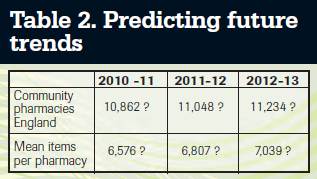 You can then start to predict the future, so that in 2011-12 the number of pharmacies is estimated at 10,119 + (4 x 186) = 10,862 etc as shown in Table 2.
The more years' data you have the more
your predictions are likely to be accurate.
Nearer predictions, such as for 2010-11 are more likely to be correct than further ones, such as for 2012-13.