Merchandising made easy
P3 Pharmacy,
![]() 2 Min
2 Min
This site is intended for Healthcare Professionals only
P3 Pharmacy,
![]() 2 Min
2 Min
P3 Pharmacy,
![]() 2 Min
2 Min
The window displays at Warman-Freed hadn’t changed in a long time. Faded posters and a mismatched theme gave way to a lacklustre exterior that didn’t reflect the in-store experience. ‘A customer’s first impression of a pharmacy is influenced before they even step into the store,’ explains Joanna Mills, research specialist at Warman-Freed. ‘A smart, clean, pharmacy exterior and an engaging window display invite people to enter and imply a professional and positive experience within the pharmacy.’
This spring, the business set out to align the external display with internal priorities to enhance awareness of product promotions, healthcare events and seasonal launches. By experimenting and learning from unsuccessful displays, Warman-Freed was able to develop a best-practice process for creating impactful and appealing windows.
This follows three guiding principles:
‘Once you think your display is in good shape, seek impartial feedback from customers or colleagues who do not work at the pharmacy,’ she advises. ‘A fresh perspective on the first impression your pharmacy creates will help identify areas for further improvement.’
The in-store experience must support the window display with clear and comprehensive communication, from shelf barkers and promotions to counter staff advice and services. ‘Striking the balance between maximising product sales and keeping shelves tidy is a constant challenge,’ remarks Ms Mills. ‘From our overflowing shelves it was clear that Warman-Freed could do more to make our offering stand out to distinguish ourselves from other retail competitors.’
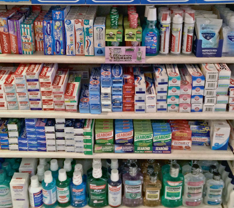
The first category to be overhauled was dental. A stock take revealed 170 different product lines spread over three bays. This excessive shelf space didn’t reflect sales and the team removed 20 per cent of SKUs. ‘A product that sits on the shelf for six months without selling is taking up valuable room,’ advises Ms Mills.
‘Remove slow-moving lines to free up space, giving you the option to double face products that do sell, introduce new lines – particularly ones which are pharmacy specific – or even reclaim space for another important category. Our sales data show that within six months, despite reducing product choice, there has been no reduction in dental sales.’
Â
 Â Â Â Â Â
     
Before and after: Warman-Freed’s dental category was streamlined for greater impact
Â
Pharmacy-only products on the back wall often get ‘lost’ with many customers unaware of the breadth of medicines available. The Warman- Freed team set out to reorganise the products, as valuable space was being occupied with items that could be merchandised in the main retail space. ‘In our reshuffle, we discovered that a topselling product – a well-known threadworm treatment, was confined to a drawer rather than sitting on a shelf,’ comments Ms Mills.
‘Four weeks after the restructure, back wall sales had increased by 23 per cent per metre, and sales of the threadworm product had risen by 13 per cent in the same period,’ she says. ‘The back wall will be refreshed regularly to take into account seasonal promotions and layout changes to align with the rest of the store,’ concludes Ms Mills.
Â